

OVERVIEW
Veyo Driver App Redesign
ROLE
Lead UX Designer
Creative Direction
UI Design
Veyo, 2016
Adding a refreshed branded feel while optimizing the overall experience
As Veyo pivoted from a consumer rideshare product to focus on revolutionizing the non-emergency medical transportation industry. I joined the team to oversee the UX/UI design and implement a consistent visual design feel across the entire product line. One of the first products I had an opportunity to work on was the driver app.
This was a key product feature because, one of Veyo’s core differentiators was providing a flexible fleet of drivers. This was accomplished through Veyo’s rideshare mobile application. It allowed the company scale quickly to meet the demand of trips that fluctuated throughout the day.
Before I joined the company had developed a working driver app. I Worked closely with the product management team, we redesigned the raw app to fit with the updated brand. During the process we also worked on additional features and optimized the user experience. The improvements included better usability, a streamlined on-boarding process and simplified driver workflow.

GOALS
Project Challenges & Themes
As the launch of the new brand loomed we needed to work quickly to redesign and optimize the app as well as design and develop the new onboarding flow. We started with the onboard feature first. It would be a step by step process developed as a web friendly feature so it could quickly be implemented into both the iOS and Android native apps. As this feature went into development the mobile team focused on the redesign of the driver app features. With the launch drivers needed to be onboarded and start using the app to quickly scale our fleet and provide proof to the new business strategy.

UX PROCESS
UX Research & Strategy
With our working beta app in hand I collaborated with the Mobile Development team, QA and Product Management to identify a product road map. We broke the app into specific features that we could work though as a team and collaborate on the UX and UI. As I designed we reviewed features on a weekly basis and the Dev Team worked through development as designs became available.
I also conducted research by signing up for other sharing economy services. I would go through the online sign up flows, attend local meetings and talked to local folks working these types of jobs to understand the user better. I took a deep dive and discover online communities and local meetup groups to immerse myself into this user group to gain empathy and understand the pain points of the current work flows. I used these insights gained to inform my design decisions.
We then recruited a local crowd testing team that would test the app on a weekly basis. They provided feedback on the UX, functionality and any bugs they found. The team would drive around the city using the app to pick up team members. These simulations provided the user feedback we needed to optimize the design. We did not have an existing team of real driver in our area, so this was the next best option to ensure the app functioned correctly.

PERSONAS
Understanding the Users
Through the redesign phase the team surveyed and researched the driver base. We took trips to markets that our drivers drove in to speak to them directly to better understand their needs and workflow. From the interviews, surveys and ride a longs we developed a few persons to provide insight into our independent driver providers.

USE CASES
Core Features
With a robust app to design and develop quickly we developed 4 key use cases we wanted to focus on for the app redesign. We felt these 4 features would be the core of the new app that we could build on, and expend with future improvements and additional features. Having a clear vision allowed us to break the design process into phases allowing us to test iterate, develop, test and continue to improving upon the work flow and the design.

GOALS
Goals/Success Metrics
Before getting to deep into the design phase the team took a strategic look at how we could measure if the redesign was a success or not. We already had drivers on the road, but we needed to optimize the hours they were driving as well as grow the fleet exponentially over a short period of time. The design would need to be flexible so we could scale into new markets. These are the key metric we came up with that we could look back once the new app was launched to see what areas could be improved and how we could continue to improve the experience.

FLOW DIAGRAMS
Establishing the Driver Workflow and Wireframes
As we broke out the features we sketched out quick flow diagrams for each to take a high level view of how a diver would navigate through each work flow. We digitized these once the team reviewed and approved each flow of the app. We used these as direction for design and development.
Because we had an existing app in place we put together low fidelity wireframes and then moved immediately to high fidelity. We worked in parallel with the dev team designing one feature handing it off to the team and moving to the next feature. This allowed the dev team to quickly build on the go and test features.

PROTOTYPE
Testing the Design
Working with the dev team we put together a functioning prototype and the local crowd testing team would test the app weekly. These tests included coming into our office or driving around the city. They would provide ongoing feedback so the team would make improvements as we moved through the dev process. This feedback was invaluable to the UX as well they provided insights in which features felt a little clunky and needed to be reworked.
Once the app was completely built out we first launched the app with a group of early adopter drivers. The team traveled to meet with a focus group of these drivers to gather additional feedback on what could be improved. We took the feedback and made decisions on which changes would make the greatest impact once we launched the app to the complete driver fleet. Each step ensured the app was ready to be used in the wild.
UI PROCESS
Visual Design Research/Strategy
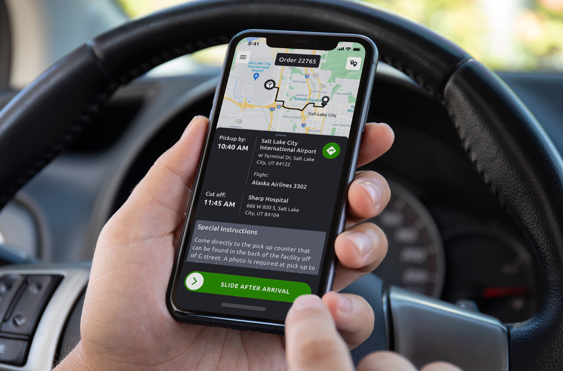
To refresh the app UI we wanted the style to be consistent with the newly finished Veyo Brand. The color palette was set and a look and feel was in place, now this needed to be translated to a mobile platform.
As we got started I looked back to the research we conducted to understand the users needs and the conditions they were driving in. The current app had a dark interface with gray backgrounds and white text. This skin was difficult to read while driving a vehicle I wanted to go with a bright white look and feel. I wanted their to be enough contrast so it was easily reviewed and interacted with the app at a glance.
One challenge I encountered was designing an app while the development team started work on developing both native iOS and Android apps at the same time. I set up a base style to be used on both platforms that include main nav bar color, the main and secondary button colors as well as main background and text color.
We then used specific iOS and Android design patterns so that each would have a native feel. We felt this would make each more intuitive for our driver base. This allowed me to quickly implement a native UI style for each app.

MARKET RESEARCH
Defining Visual Design Direction
The sharing economy and in particular the rideshare industry was rapidly growing, so I what to take a look at how other players in the market designed their apps. This was done for a few reasons, I wanted to see what worked well and what could be improved on. I also wanted to see if there were opportunities to be innovative and make the interactivity as smooth and intuitive as possible. We were looking to grow rapidly and onboard new drivers fast, so we wouldn’t have time to train these drivers, the app would need to be intuitive and easy to use.
MOODBOARD
Establishing the Look and Feel
To put everything together that I learned from my research I developed a moodboard that I could look back to while designing the UI. The moodboard include type treatments, ideas for illustrations and icons as well as UI inspiration.

DESIGN INSPIRATION
UI Design Patterns
Now that I had the brand guide I wanted to take a look at a variety of apps to get some additional inspiration. These could be award winning apps or apps with innovative design styles. I wanted to immerse myself in mobile design styles and patterns in order to come up with a unique branded look and feel. The team was aiming to develop native apps for both the iOS and Android platforms in parallel which was a big undertaking. I read blog articles on best practices to design for each platforms and how other companies tackled this challenge. I then looked back at the iOS design human interface guidelines and material design guidelines to establish specific patterns for each platform. I started designing for iOS first but included direction for specific UI elements for the Andriod platform as well.

UI DESIGN
High Fidelity Mock Ups
Now that I was filled with inspiration and research, I went to work on the high fidelity mockups. The design and development phase would move rapidly which made it challenging to conduct any solid usability testing for each design. We decided to design one feature at a time conduct an internal team review and then hand off the designs to the dev team to include in the early function prototype to be crowd tested.

DESIGN HANDOFF
Design Specifications
Once I finished designing a feature it would be put into into the mobile development sprint. I spoke directly with the team and provided specs for the team detailing out size, spacing, padding and color. I also exported all of the icon, and visual assets for both iOS and Android platforms.

RESULTS
Driver Feedback
As the new app launched the team surveyed the Veyo driver community to see what they though about the redesign.
“The old driver app was like grade school. This new app is like Harvard graduation”
“This app seems so far very good. NO bugs, the longest I waited for a fare is about 5min at most. No issues since I’ve downloaded it. Thank you”
“Great new look, faster screens, like the online/offline, logout, more intuitive, more easily navigate through screens,…”
“(BTW, whatever genius came up with idea to show a mini map in the trip history, hats off to you or you all. Really makes it easy to go back and find the trip you want to review. Brilliant!) Great job!”
“All in all, I am pleased with what I saw with the app today. Thanks for your efforts!”
