OVERVIEW
SoccerLoco E-Comm Platform
ROLE
Creative Direction
UI Design
Digital Operative,
2014
Elevating an Online Soccer Brand to a Modern Soccer Shopping Experience
Soccerloco was founded in 1997, with a passion and desire to be a destination for soccer enthusiasts. Grown from a number of southern California brick and mortars, to an online retailer, the company had established itself in the industry.
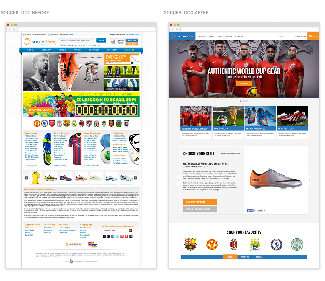
As they looked to grow sales online and expand their market share they looked to the team at DO to rethink the online strategy and freshen up the online brand. For the new site they wanted to grow their sales and compete with the array of competitors moving into the market. The site had to speak to their current band for consistency, while at the same be elevated to become a premium online shopping destination.
GOALS
Design Objectives
1. Redesign and optimize the complete online shopping experience
2. Simplify and improve the IA to facilitate a more informed shopping experience
3. Mobile optimized for the best experience on all devices
4. Modern sport look and feel establishing the brand as a premium online retailer
5. Implement a laundry list of new features to improve and engage customers
6. Facilitate custom shopping flows for different audiences
7. Improve the experience for Soccer club customers to tap into an additional revenue stream
8. Integrate content with commerce and social media to engage the shoppers and keep them coming back
UX PROCESS
UX Research & Strategy
What we knew was SoccerLoco delivers the performance products and innovative experience needed to take committed players, teams and fans to the next level. The brand represents the sheer passion and hysterical love for soccer. The “loco” or crazy references their commitment to provide players with a confident swagger, the authentic fan with unwavering support for their favorite club, and any other person to whom soccer is much more than just a game. Their team wanted to take this passion and infuse it into or design and development process. We wanted to deliver a customized shopping experience.
We started by meeting with the client to kickoff the project. We wanted to better understand their current challenges, the demographic of the shoppers coming to the site and how we could work with them as partners to rebuild the site. From this meeting we established a vision for the site and the defined research we needed to conduct to better understand how we could truly revolutionize their current online platform.

FIELD RESEARCH
Having the Same Experience as the User
We wanted to truly empathize with their customers and pull together some qualitative data, so we joined the team at one of their large southern California soccer tournaments, the San Diego Surf Cup. We watched the games, toured the pop up soccer shops and spoke to the players, parents and the audience to gain an immersive connection with their wide customer group. We also took time to stop by their brick and mortar stores to get a birds eye view into the day to day shopping experience. Finally we engage with their audience through social media, yelp and online surveys. This gave us a complete understanding of the customers shopping life cycle.
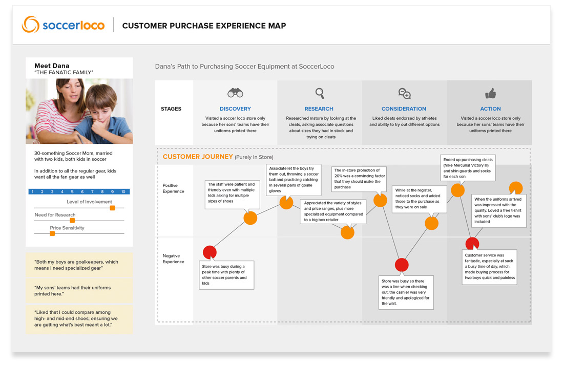
CUSTOMER JOURNEY MAP
Defining the Journey
From their we developed user journey map for a few specific demographics. We demonstrated to the client where the shoppers were satisfied in their shopping experience and where the service could be improved. With these improvement in place the site would speed up the conversion process and deliver more sales.
COMPETITIVE ANALYSIS
Understanding the Competition
Additionally we took a look at the array of competitors moving into the market. We wanted to see how we could chip away at their market share and set up a game plan to move the needle for SoccerLoco. This competitive analysis gave us a direction on which site features we needed and which would allow the site to stand out from the crowd.
PERSONAS
The Users Goals
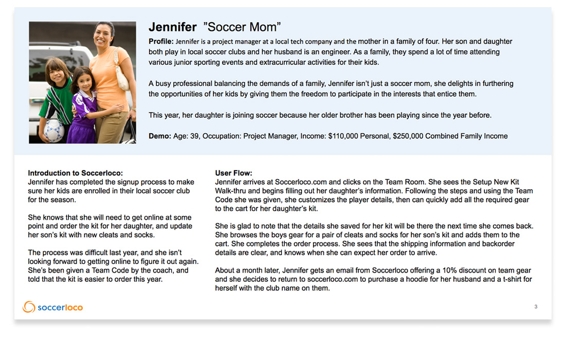
From all of the research we conducted we define specific persons for the site. We saw that there were a variety of different audiences coming to the site. We detailed out high level info about each audience. But what we really wanted to understand was why they were coming to the site, what motivated them and what they needed to make a shopping decision.
USER FLOWS
The Users Goals
We could see that each unique audience would flow through the site from different avenues. We broke down the site into four specific shopping flows. We wanted to build these flows so the each audience could find what they were looking for with the least amount of friction. The four flows defined:
- The High level Player/Parent Shopping Experience
- Shopping for Shoes
- Shopping for Apparel
- Shopping for Equipment
- The Enthusiast/Fan Shopping Experience
- Shopping by Player
- Shopping by Team
- Shopping by Brand
- The Team/Club Shopping Experience
- Shopping for team Apparel
- Shopping for team Equipment
- The Bargain Shopper Experience
- Shopping for the best price on:
- Shoes
- Apparel
- Equipment
- Shopping for the best price on:
FLOW DIAGRAMS
Directing the User
From these user flows we created high level flow diagrams for each. This helped us define the content strategy and inform the improved IA for the site.
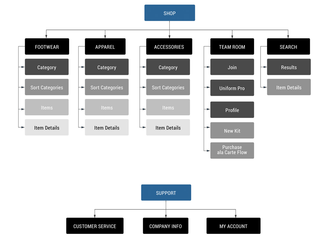
SITE MAP
Establishing the site architecture
The flows gave us direction for the sites information architecture. We wanted the experience to link shoppers through to the most pertinent category level landing pages. Each of the category level landing pages would packed in a ton of content for SEO value and guide shoppers through the site. Shoppers could quickly find what they where looking from link in the top navigation, robust mega menus or from the site search bar.
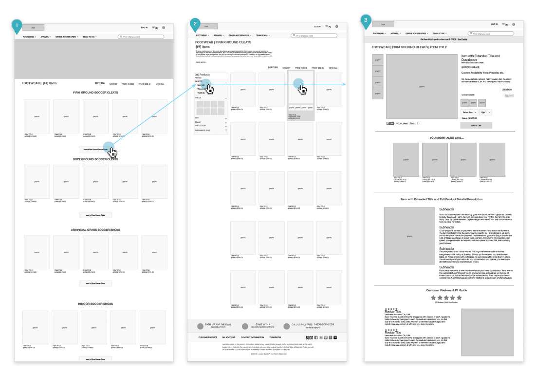
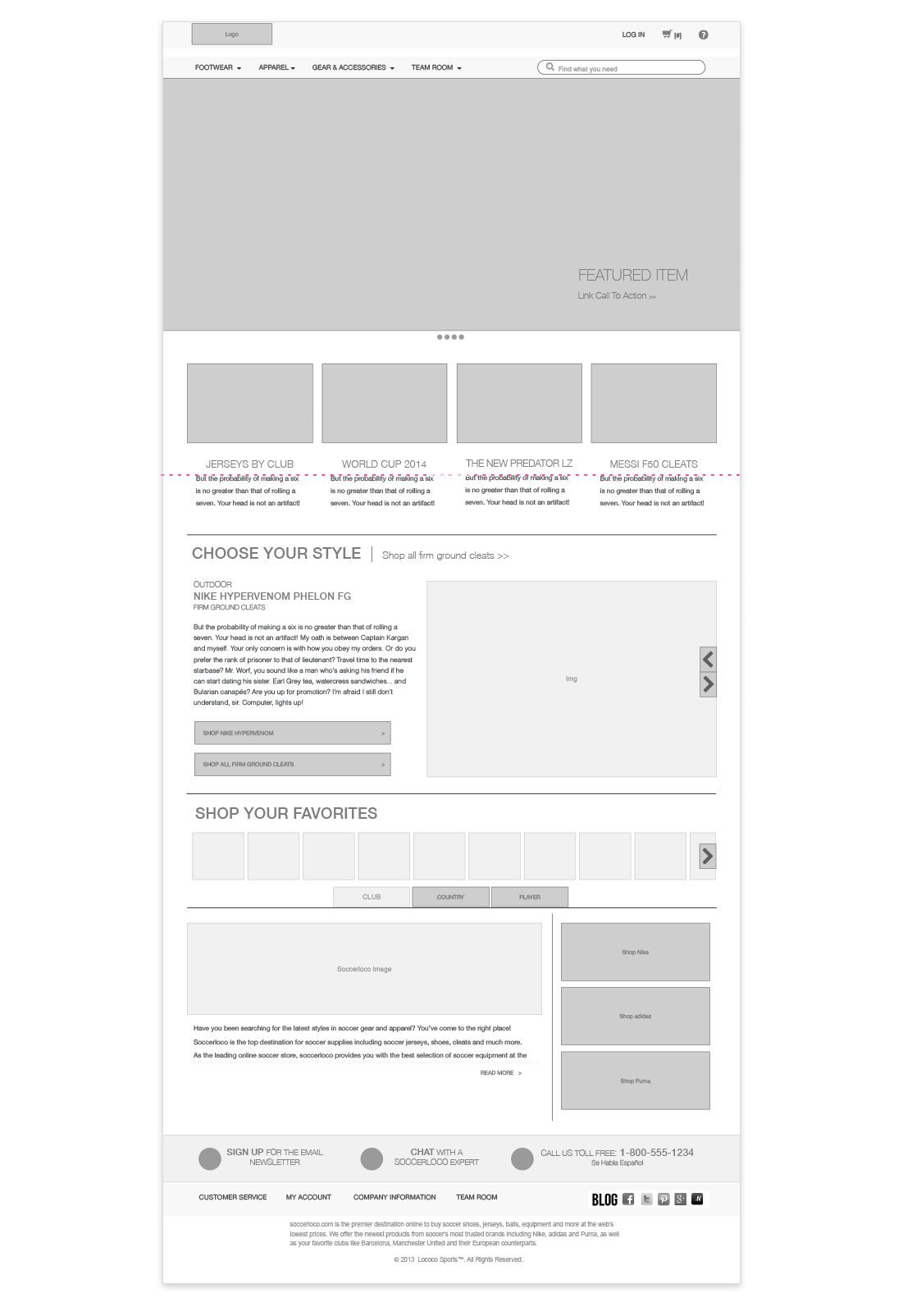
WIREFRAMES
Designing the blueprint
We built out the complete website in low fidelity wire frame documents. With over 80 wire frames designed an annotated, these include desktop, tablet and mobile views. Here are a few of the highlights:
UI PROCESS
Visual Design Research/Strategy
Re-framing an online soccer experience required various discovery and conception phases. We continued to include detailed research in the UI phase of the project. We continued to push through different user experience solutions and provided a variety of design directions through the phased approach.
The company already had an established brand in place. The logo and colors were clearly defined and could influence the new site the design. The team felt some of the current branding design decisions such as illustrations and gradations made the old site feel a little too friendly and almost comical for the diverse audience they were looking to attract.
We again looked at the competitors in the market, but beyond that we wanted to pull some additional fresh inspiration for the site. The site needed to scream cutting edge and our them knew the UI had to provide this mark.
Here’s how we guided them to a modern, sophisticated design look and feel.
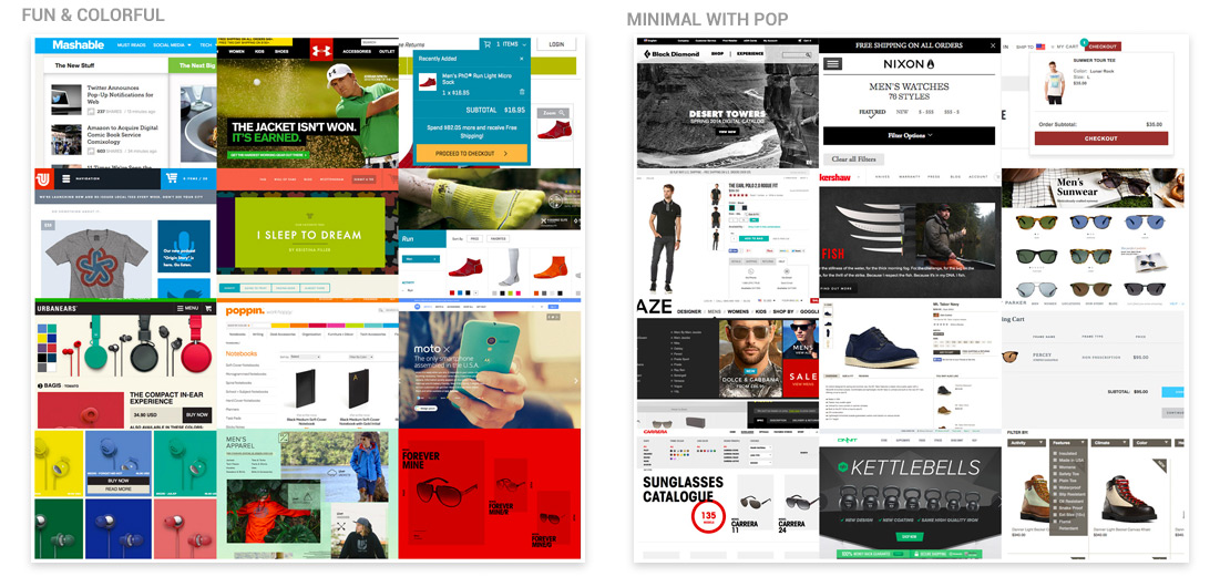
MOODBOARDS
Defining Visual Design Direction
Working with our partner clients we started to discuss a direction for the site by pulling together mood boards. These would set the tone for the look and feel and help make decisions on font choices, UI elements and how to style illustrations and photography throughout the site.
UI DESIGN
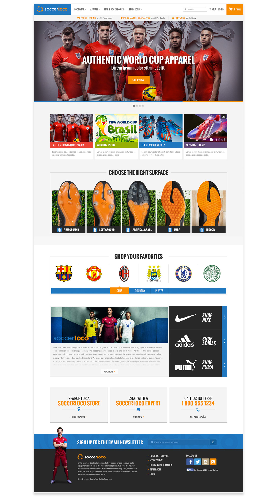
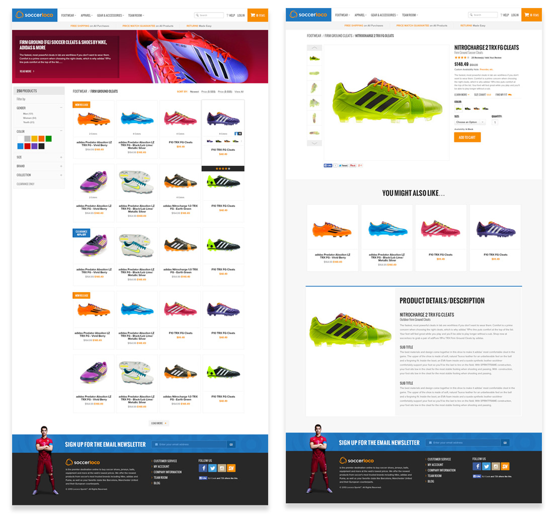
High Fidelity Mock Ups
After understand the direction the client was looking for our team put together two high fidelity design directions for the site. From these mock ups we made a few tweaks and combined a few great elements to finalize the selected direction. The design esthetic was highly visual so shoppers could view and feel the quality of the products. These visuals guided the users though the shopping experience.
MOBILE UI
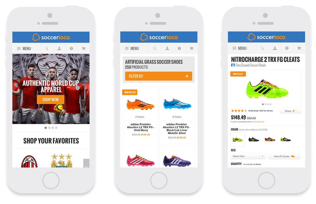
Optimizing the Design for Mobile
After researching the market the team decided to launch a mobile specific site for the traffic coming in on smartphones. Because the direction was so visual on the desktop and tablet we wanted to reduce load time for mobile devices. We scaled back the visuals and the content for small screen resolutions.This ensured customers would have the ability to shop and browse the site from anywhere at anytime including soccer tournaments.
DESIGN DOCUMENTATION
Design Specification Hand-off
Once the site was fully flushed out the dev team started coding the back end. This was no easy task. Design and dev worked hand in hand through the development phase. We had an internal kickoff to present the creative. We provided specs through annotated wireframes and high fidelity mockups so they had a good understanding of the micro-interactions. Throughout the dev process we had pairing and sharing meetings to provide additional feedback.
Once the site was at a good place we provided design QA feedback on minor spacing and style adjustments that needed to be made. Luckily we had a client with a keen eye for detail so again we partnered with him to ensure the site met his expectations. Countless calls and meeting lead to a highly polished final result.
SITE STYLE GUIDE
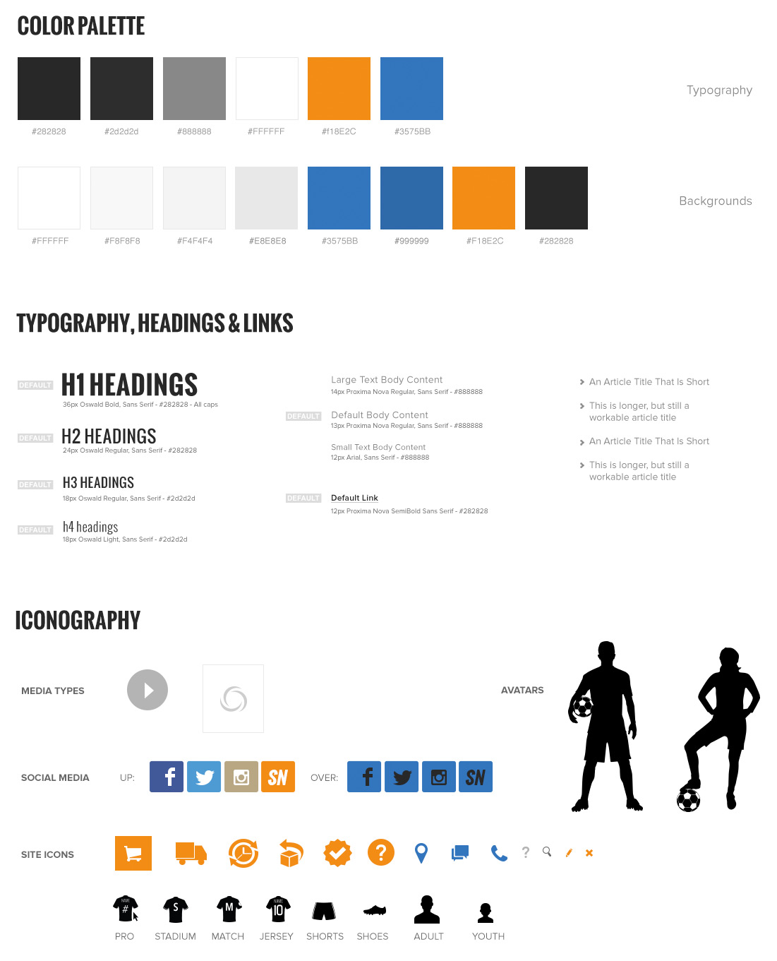
Defining a Design System
Additional design direction for the development team was built into a detailed design system. The design team provided direction:
This included Colors, Fonts, Grids, Form Elements, Icons, UI elements, Templates
THE RESULTS
Final Design Value
- The site was transformed from a minimally functioning website into a robust e-commerce business growing the revenue 30% in the first year of the relaunch
- We won some awards, they included a Silver W3 Award and mentions on a variety website of the day award sites
- The site was also optimized for specific devices. The desktop site was responsive down to tablet devices. The a mobile specific would populate for mobile screen resolutions
- Customers were engaged this showed by seeing there Facebook following grow 2,000% to 260,000 and Instagram following 800% to 45,000+ within one year
- Audience specific personalization was built on-site and across marketing channels to improve customer experience, reduce marketing costs and improve both conversion rate and average order value


